[feature_headline type=”left” level=”h2″ looks_like=”h6″ icon=””] “… the strange blue creature that is barely visible inside the house gradually begins to emerge as a realistic depiction of Self.”[/feature_headline]
The contrast between inner and outer, soul and body, substance and show — that same duality Art has the power to overcome — this contrast is one of the central motives in Shakespeare’s sonnet sequence (just as it is a central motive of our lives). Can a painter express this contrast in colour, which is, after all, nothing but “show” par excellence?
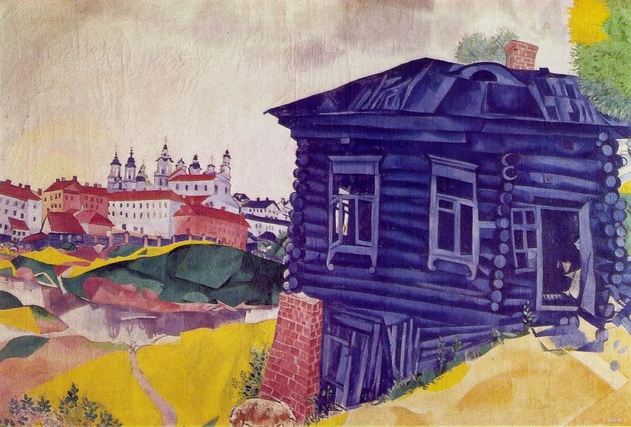
This is exactly what Marc Chagall does in “The Blue House”.
“The Blue House” is as it were duality embodied: the house and its surroundings don’t really belong together; they come as though from different sides of reality.
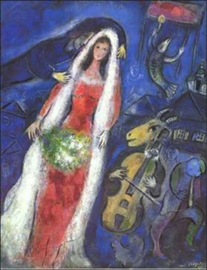
Of course, combining things that don’t belong together is a hallmark of the twentieth century painting, and Chagall was no stranger to this trend.
But “The Blue House” is different: unlike violin-playing goats, houses naturally belong to landscapes (and cityscapes). So where does this tangible feeling of non-belonging, of separateness come from?
It is achieved (almost) entirely through colour: the yellow-green-red landscape versus the monochrome blueness of the house. There are touches of blue here and there in the landscape, but that’s because there are certain insurmountable limits to disintegrating a single painting into two clashing parts, which, apparently, even Chagall could not break. As someone who has attempted this kind of disintegration many times in my own paintings, I am almost sure that he did try to make it work without any blues outside the house — but the painting needed these blue patches in order not to fall apart completely. So he confined these blues to roofs and fences, and made his point by not letting any appear in the sky, even though the overall child-like, honey-and-milk quality of the landscape seems to call for a bright blue sky.
Apart from these patches of blue, the colours on the left are straightforwardly realistic, albeit in their child-like, somewhat too straightforward, way. There is nothing unexpected in this yellow ground, green river bank, the white walls and red foods of houses, and (last but not least) the brownish dog in the foreground enjoying the sunny day. It’s all as it should be.
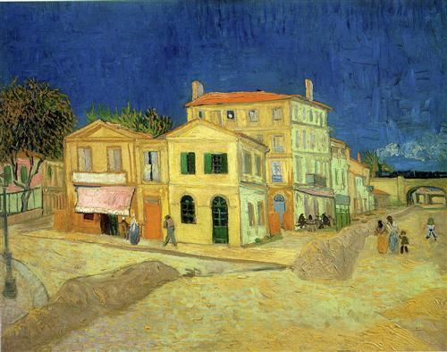
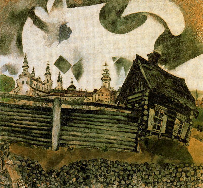
But the blue house? In contrast to, say, Van Gogh’s “yellow house” — which, we may assume, was yellow “in real life” — the blueness of this house belongs decidedly to the painting, not to the thing being painted. We see that the house is bare wood; its “true” colour would be close to that in “The house in grey” (below), from the same year (quite likely, another approach to the same pictorial motive). The blue of the house comes into the painting as though from another world entirely — not from the visible, but from the invisible.
And the house is not just blue – not in the same sense Van Gogh’s house is yellow; not as a “real” blue house would look like in a realistic or impressionistic painting. It is monochrome (with blue standing for black), without any variations in hue. That’s how we see things in the darkness, when the cones of our retinas don’t have enough light, and only rods are doing the seeing.
The landscape and the house are painted in two quite distinct value ranges, as though they existed in different lighting conditions: the landscape is light, the house is dark. There is nothing unusual in contrasting value areas in a painting; what is unusual here is that both light and dark areas are rich with essential details. Painters generally avoid this, because the human vision works in such a way that we cannot see both sets of details simultaneously:
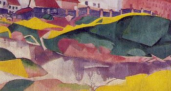 Concentrate on the landscape, and your eyes adjust to its sunlight, and then you notice the reflections in the river, and the grazing cows on the other bank, and the dog.
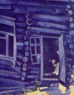 Concentrate on the house, and your eyes adjust to its darkness, and then you see a strange, lonely, human-like creature inside.
We experience this adjustment of vision in real life when we enter a dark house on a sunny day, but we would normally expect the outside of the house to be just as sunlit as its surroundings. Here, it is as though the outer walls of the house, not only its interior, are lit not by the sun outside, but by some meagre blue light source within.
There is an additional effect of this blueness which might not be obvious when you look at the painting on your computer screen, but would be quite conspicuous if you were to look at the original: blues “recede”. This is because, in real life, the farther away something is from us, the bluer it looks; reds, yellows, greens — they all disappear with distance. This effect is commonly used by painters to suggest distance in landscapes to the viewer’s eye, but Chagall does quite the opposite — almost all his reds are reserved for the distant vista, almost all his blues, for the house in the foreground. We know that the house must be closer to us than the cityscape, but this effect of receding blues still works on another, unconscious, level.
To strengthen the near-split of the painting into two separated realities, Chagall defies one of the major laws of composition and divides the pictorial space right in the middle of picture plane. He couldn’t have known it in 1917 (at least not consciously), but a modern scientifically-minded viewer might notice that if they view the painting as a whole, it’s the left eye (hence the right hemisphere of the brain) that sees the landscape, while the right eye (and thus the left hemisphere) is presented with the blue house. If a viewer spares this painting but a brief glance (as, unfortunately, people often do in museums), the two sides of their brain would, for all we know, go away with two nearly opposite impressions of what is actually depicted in the painting, let alone its overall mood.
While writing the above, I even began imagining an experiment to check this hypothesis, but, of course, it is far more interesting to know what the painting conveys to an attentive viewer — someone who would spend some time switching between two conflicting views and letting a coherent impression emerge in its own time, as the two sides of their brain try to integrate these two quite different pictures into a coherent image through their (rather narrow) channels of communication.
For me, the viewing of this painting feels like switching between two states of mind: the state of complete, child-like openness to the visible world, with all its richness of colour, and the state of being immersed in my own thoughts, in the dialogue between me and myself; the mind directed outside and the mind focused on itself; vita activa and vita contemplativa. And then the strange blue creature that is barely visible inside the house gradually begins to emerge as a realistic depiction of Self.
Maybe even somewhat too realistic for comfort…
P.S. If I was briefly tempted to offer an explicit interpretation of the message Chagall wanted to convey to the viewer in “The Blue House”, he himself dispelled this temptation with a small detail of “The house in grey”. You might have missed it if you don’t read Russian (and even if you do), but there is a graffiti message on the fence, right in the center. It says, in capital letters: FOOL.
[share title=”If you’ve enjoyed reading this post, please consider sharing it with your friends!” facebook=”true” twitter=”true” google_plus=”true” linkedin=”true” pinterest=”true” reddit=”true” email=”true”]