Have you ever wondered whether colours feel the same for you and other people? Is your sensation of a certain colour unique, or is it more or less the same for everyone?
I was fascinated with this question as a child — probably since I had learned the names of colours. I used to pester my parents with this question: how can we know that “red” means for me the same as it does for you? They would answer something about asking each other about each individual thing whether it’s looks red or not — and I tried to explain that this wouldn’t help, because we would never know if it feels the same for both of us.
Only much, much later did I learn that this is a fundamental philosophical problem of “qualia” — conscious, subjective experiences which cannot be shared between people (at least not in any direct way). In fact, colours seem to be the philosophers’ favourite example of this problem.
Scientists can measure and compare wave lengths for different colours, and now even the reaction of various cells in retinas and neural responses in the brain, but none of that solves the problem: we still cannot know whether our subjective sensations of colours are the same.

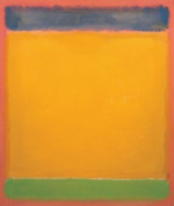
This presents a problem for a painter who seeks to express emotions and create moods through colour, especially if they reduce, or completely abandon, representational means of expression. If a painting depicts, say, a mother with her baby, or a bloody battle, it can influence the viewer’s emotions even if its colours couldn’t do that on their own. Mark Rothko’s colour compositions aim to do the same with colour, and nothing but colour.
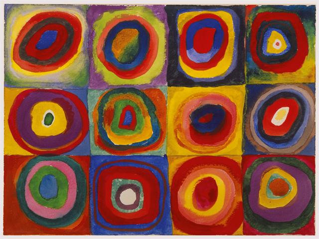
The whole movement of abstractionism in painting seems to hinge on the artists’ faith in universal “inner meanings” of colours. No wonder, then, that the prophet of abstract painting, Wassily Kandinsky, dedicated a huge part of his manifesto book, “Concerning the spiritual in art” to analysis of these meanings. He calls them “spiritual vibrations”:
“To let the eye stray over a palette, splashed with many colours, produces a dual result. In the first place one receives a PURELY PHYSICAL IMPRESSION, one of pleasure and contentment at the varied and beautiful colours. <…> But these physical sensations can only be of short duration. They are merely superficial and leave no lasting impression, for the soul is unaffected. <…> the second main result of looking at colours: THEIR PSYCHIC EFFECT. They produce a corresponding spiritual vibration, and it is only as a step towards this spiritual vibration that the elementary physical impression is of importance.” (boldface is mine, AllCaps are original).
At the core of his soul-oriented theory of colour are two interrelated oppositions: warm versus cold, and light versus dark. Kandinsky was writing several decades before cross-linguistic research on colour terms, but I am guessing he would have been delighted to learn that here he hit at the single universal colour opposition. Different languages have different systems of basic terms, but the contrast between warm/light and cool/dark is the only one present everywhere. That’s probably because it expresses the contrast between day and night.

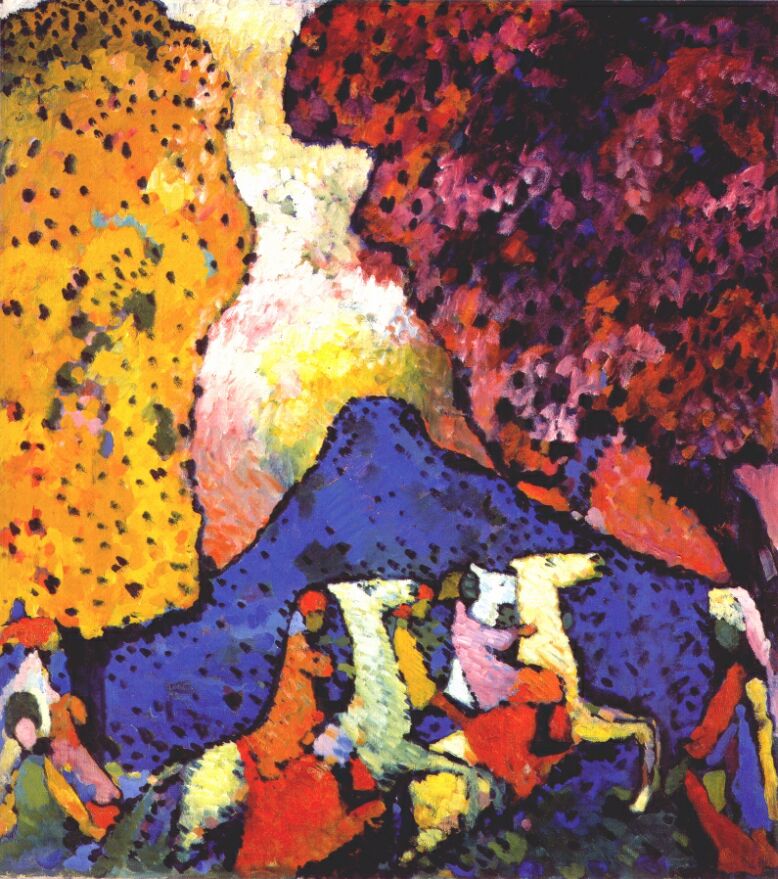
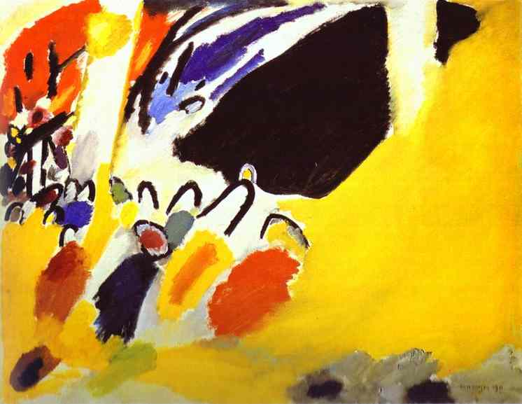
For Kandinsky, yellow and blue are the core instances of “warm” and “cool” respectively. Every colour theorist would agree that blue is the quintessential “cool” colour, but yellow is a much less usual choice. Kandinsky’s intuition is based primarily on the inherent link between warmth and light: yellow is, intrinsically, the lightest colour, closest to the white. There can be no “dark yellow”.
He formulates two core sensory distinctions between yellow and blue in terms of movement:
- Yellow moves towards the viewer, outward from the picture plane. Blue recedes, that is, moves away from the viewer.
- Yellow moves out of itself, that is, a yellow colour area seems to expand. The blue moves within itself, concentrically.
Kandinsky links yellow with human energy:
“The first movement of yellow, that of approach to the spectator (which can be increased by an intensification of the yellow), and also the second movement, that of over-spreading the boundaries, have a material parallel in the human energy which assails every obstacle blindly, and bursts forth aimlessly in every direction.”
Yellow is an “earthly colour”, which therefore can never have a profound spiritual meaning. This is the prerogative of blue:
“The power of profound meaning is found in blue, and first in its physical movements (1) of retreat from the spectator, (2) of turning in upon its own centre. The inclination of blue to depth is so strong that its inner appeal is stronger when its shade is deeper. Blue is the typical heavenly colour.”
In other words, his interpretation of this colour contrast is anchored to familiar fundamental dualities: “matter” against “spirit”, “earth” against “heaven”, “man” against “God”, etcetera (admittedly, he doesn’t actually use the word “God”).
This focus on duality is what bothers me about this (otherwise quite insightful) interpretation. I’ve come to believe that all these dualities are more misleading than useful, and, furthermore, that overcoming them might be the art’s true purpose. What strikes me as especially interesting, though, is that the spiritual side of the duality turns out so straightforwardly associated with melancholy, coldness, darkness, even with grief.
There are, basically, two active stances a human being can take towards life: one can be saying “yes” to life, or one can be saying “no” (I believe this formulation belongs to Nietzsche). In the most basic sense, this is the contrast between yellow and blue: yellow stands for yea-saying, and blue, for “nay”. And Kandinsky’s obvious preference for blue over yellow seems to foreshadow the century-long preference for nay-saying in art, with yea-saying often considered somehow superficial, kitschy, or even downright stupid or “bourgeois”.

The century has been awful enough for anyone to want to yell “Nay!” at times, but it seems to have left us with the idea that optimism, yea-saying, is somehow easier or even less courageous than nay-saying. In my view, nothing could be further from the truth — and it is evident from Kandinsky’s works that he was far more inclined towards “Yea” in painting than in his theoretical contemplations.